Case Study ↓
Brand Strategy · Campaign Strategy · Creative Direction · Photography Direction
Making Understatement
a Point of Difference
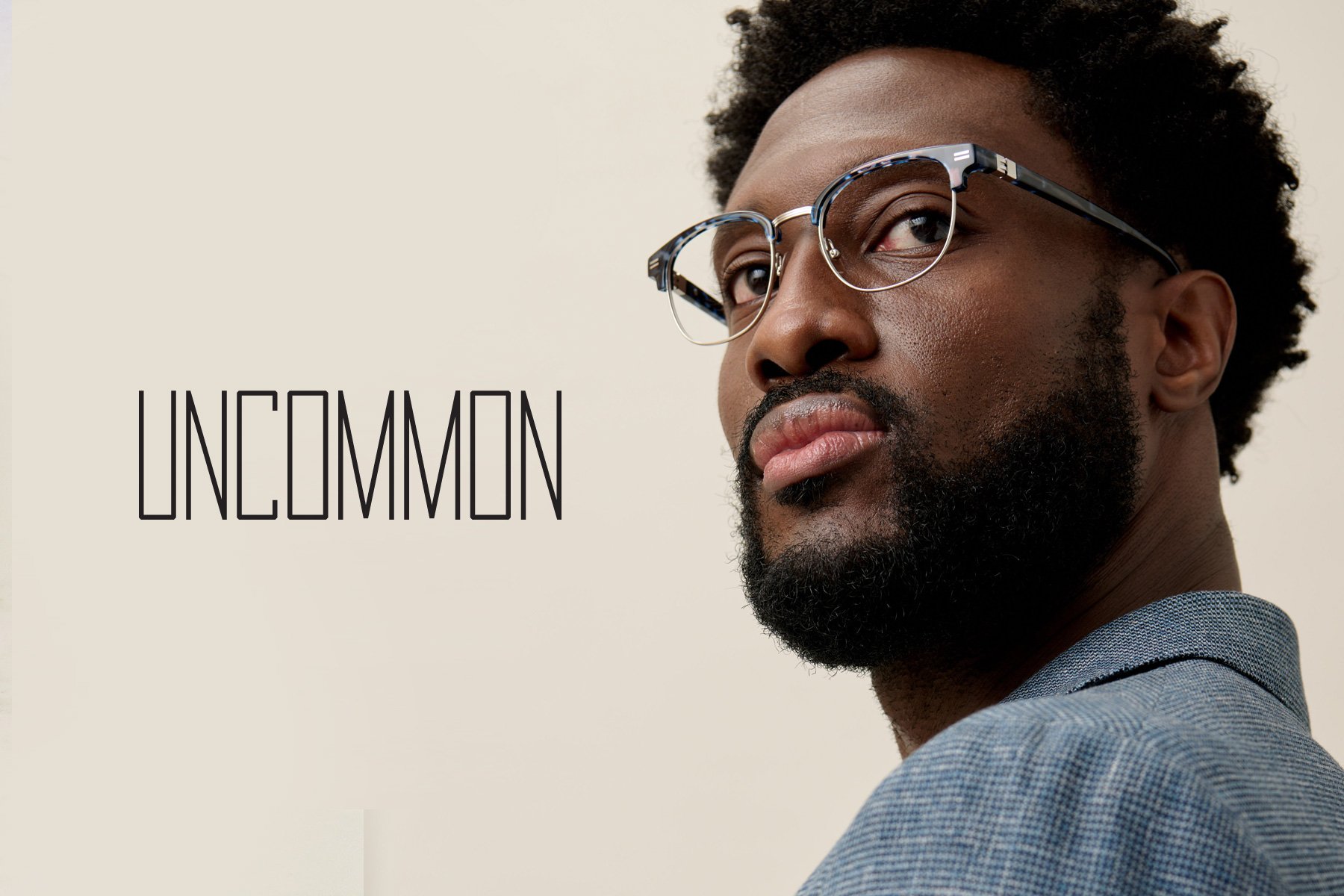
ClearVision Optical was channeling 70 years of eyewear expertise into Uncommon, a new men’s private label. In a category crowded with familiar silhouettes and overt branding, the challenge was to give a quietly distinctive product a point of view that felt just as considered as the frames themselves.
Insight
In a world of conformity, personal style is a tool for liberation.
Uncommon frames create a distinctly personal experience for the wearer, where quiet design choices come together in ways that feel decidedly different from typical mid-market eyewear. From the outside, Uncommon may be hard to identify—and that’s precisely its appeal. Grounded, purposeful color, thoughtful craftsmanship, and details discoverable primarily by the wearer elevate each pair on a personal level. After all, that’s what personal style is ultimately about.

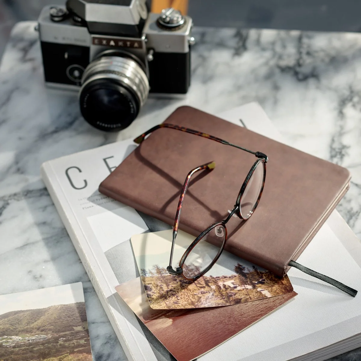

Understated. Unexpected. Uncommon.
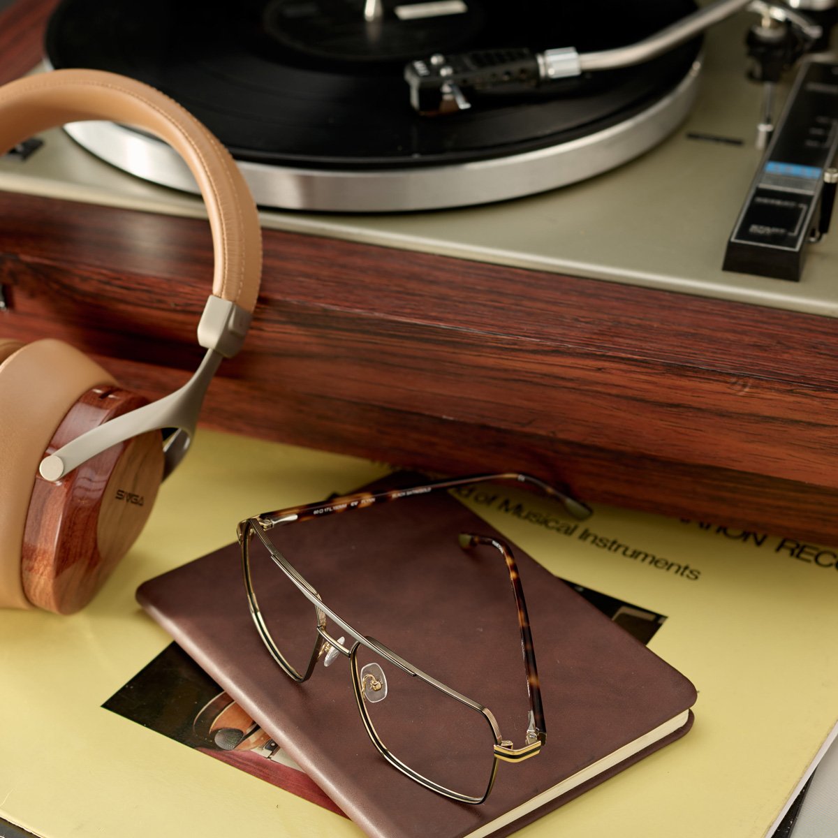
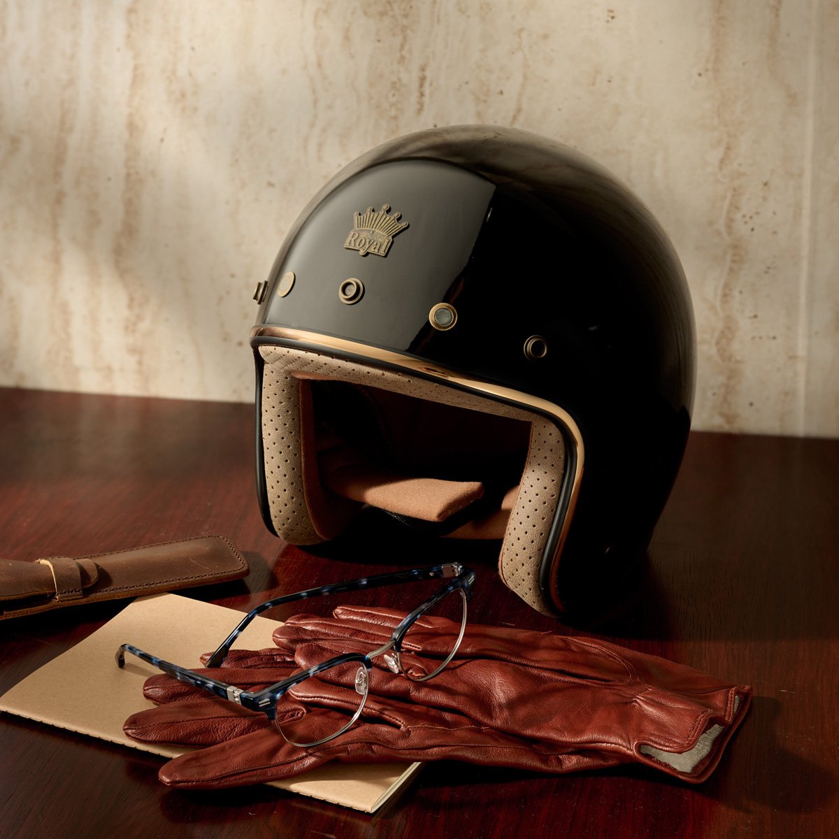
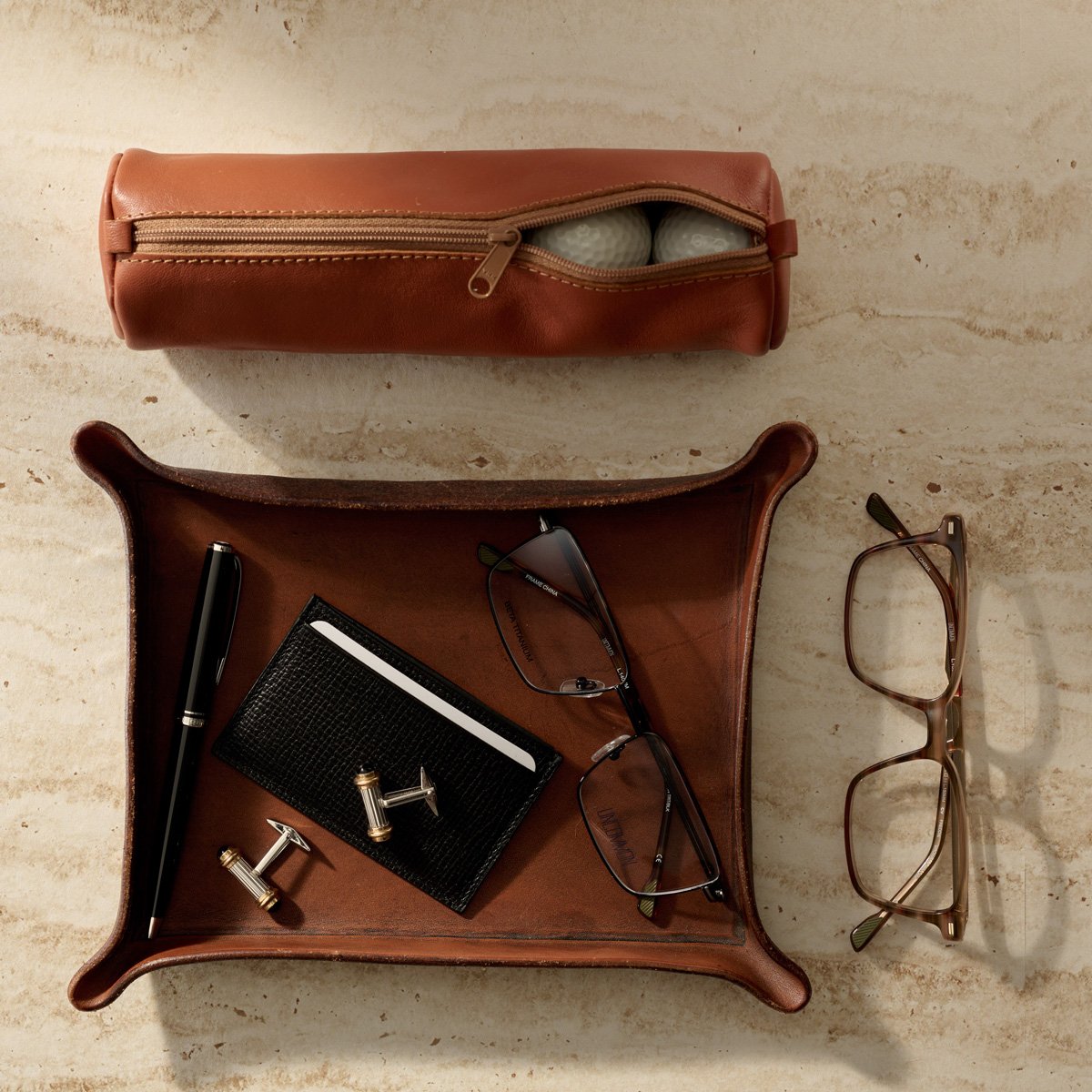
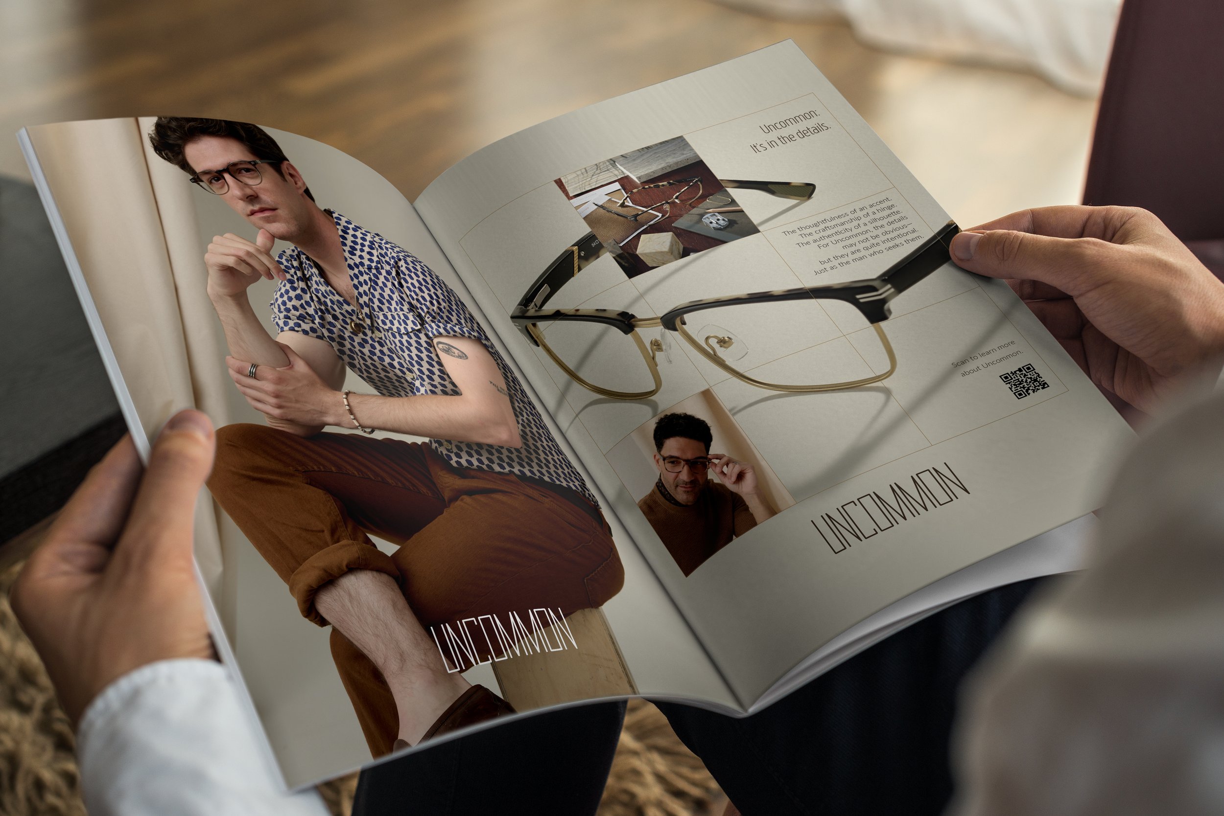
The creative strategy was to focus on the intricate details of the Uncommon eyewear and to portray the essence of the Uncommon man—someone who appreciates the finer details, embraces style, and curates his life with meticulous care. Subtle, sophisticated details were highlighted through thoughtful styling. Complementary product vignettes gave clues to his lifestyle and interests.
Photography by Corey Maywalt · Styling by Rika Watanabe · Props by Pablo Olguin
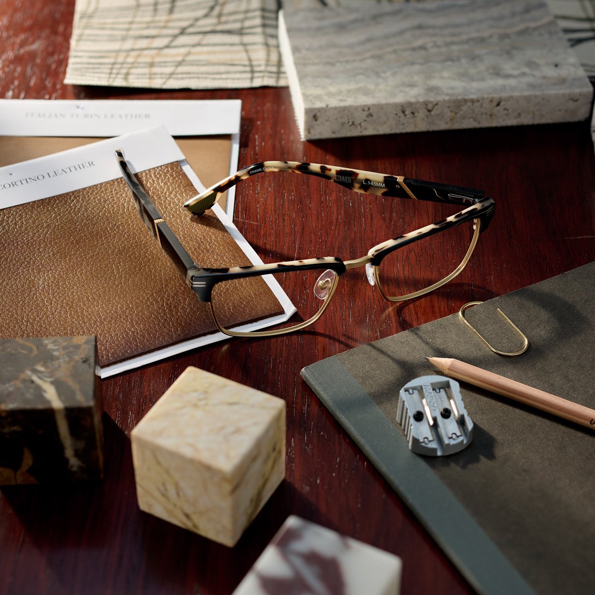
Uncommon: It’s in the details.
A considered accent color. An unexpected hinge. A silhouette that feels familiar until you look closer. Each image rewarded attention, reinforcing what made Uncommon different: this wasn’t eyewear designed to stand out from across the room. It was designed to be appreciated up close.